

In this article9 sections
Key takeaways
- Plan an ecommerce mega menu around one organising principle first: who the product is for, what kind it is, what problem it solves or how it looks.
- Use a mega menu only when the category tree has real depth; a small, flat range needs a simple menu and visible search.
- On desktop, add a 300–500 ms hover delay, open each panel from a real button and let Escape close it.
- Rebuild the menu for phones instead of shrinking it: categories at the top level, one group open at a time.
- Read counts and images from the catalogue and give the menu an owner, or it drifts out of step.
An ecommerce mega menu makes a large catalogue easy to browse when it is built around how shoppers start looking: by who the product is for, what kind of product it is, what problem it solves or what it looks like. Pick that principle first, then get the hover timing, keyboard access and mobile version right.
When Baymard Institute benchmarked 344 top-grossing US and European ecommerce sites on homepage and category navigation, 76% performed at a level of “mediocre” or worse. Planning a redesign for a broad catalogue? Below are four menu models from Dutch stores we built, the desktop and mobile details that decide whether they work, and a checklist for your design review.
What a mega menu is for, and when you don’t need one
A standard dropdown shows one list. An ecommerce mega menu opens a wide panel with a whole branch of the catalogue: departments, their categories and often an image or a promotion. In one glance, shoppers should see what you sell, how much of it there is and where to click next.
That only pays off when there is a branch to show. If your range fits in six or seven collections without sub-categories, a simple menu, visible search and strong collection pages serve shoppers better. Once departments have their own sub-categories, or product types repeat across audiences, a plain dropdown buries products several clicks deep.
Draw the category tree first
Export your collections, arrange them as a tree and count the levels. If the tree is shallow, spend the budget on search and collection pages instead of a bigger menu.
Choose the organising principle before the layout
Most menu projects start with layout. Start a step earlier, with the shopper’s first question: where do I begin? The answer usually falls into one of four starting points.
- Who it is for: men, women, boys, girls.
- What kind of thing it is: tents, cool boxes, hiking boots.
- What problem it solves: a goal, a need, a life stage.
- What it looks like: product families people recognise on sight.
Lead with the one most of your shoppers start from; the others become filters, sub-groups or tiles inside the panel. Each of the four stores below leads with a different one.
Four ecommerce mega menus from stores we built
Most mega menu examples online are screenshots of global brands. These four come from Dutch stores we built, all live today, and each one answers the shopper’s first question differently.
Audience first: Rehall
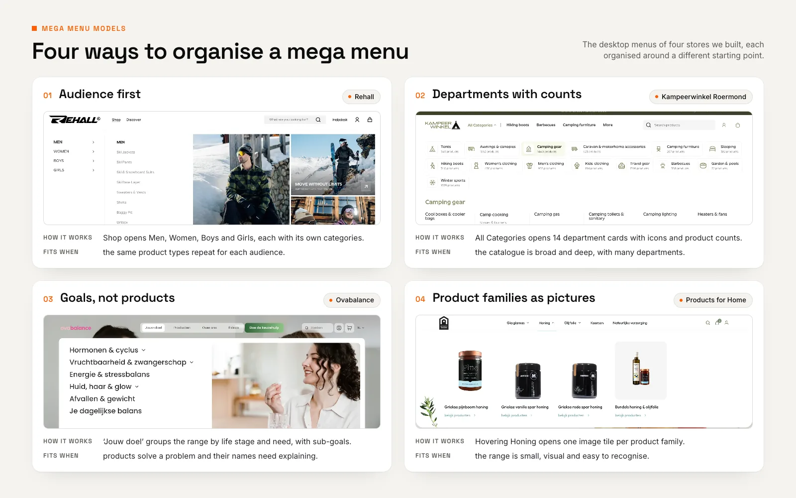
Rehall designs technical ski and snowboard outerwear for men, women and kids, and sells it in the Netherlands, Belgium and Germany. On the Rehall store we built, hovering Shop opens a mega menu split into Men, Women, Boys and Girls. Each audience’s categories are one hover away, and half of the panel is given to editorial campaign tiles.
It fits because a deep range of jackets, ski pants, suits and base layers is spread across four audiences: asking “who is it for?” first narrows it before anyone reads a category name. Copy it when product types repeat across audiences, and reserve part of the panel for the season’s story. See Rehall’s Shopify mega menu in the case study.
Departments with product counts: Kampeerwinkel Roermond
Kampeerwinkel Roermond sells more than 9,400 camping, outdoor and winter sports products, and its menu holds 14 departments and around 190 collections. In the Shopify theme we designed and built, All Categories opens a full-width panel of 14 department cards, each with a line icon and the department’s product count. Hovering a department, such as Camping gear (1,440 products in October 2026), lists its sub-categories underneath.
This matches how people shop for camping gear: department first, then type, then brand and price, with counts showing the size of every aisle. Copy it when the range is broad and deep, and pair it with search that never hides; here, predictive search sits in the header on every device (see our guide to Shopify product filters and search). The case study shows Kampeerwinkel Roermond’s 14-department menu.
Goals instead of products: Ovabalance
Ovabalance is a Dutch women’s health brand. Its customers arrive with a concern, such as their cycle, fertility, menopause or skin, not a product name. So the store we designed and built leads with “Jouw doel” (your goal): a mega menu grouped by life stage and need, with expandable sub-goals, an editorial photo panel and a “Doe de keuzehulp” quiz button pinned in the bar. A second panel, Producten, previews bestsellers.
With 43 products the range is small, but a supplement’s name does not tell you whether it suits you. A goal-first menu translates the range into the customer’s own words. Copy it when products solve problems: keep a product route for repeat buyers and a next step, like the quiz, for the undecided. More on Ovabalance’s goal-first navigation in the case study.
A goal-first menu translates the range into the customer’s own words.
Product families as pictures: Products for Home
Products for Home sells raw Greek honey from Samos, extra virgin olive oil and Gia Giamas fruit refreshments on WooCommerce. On the store we designed and built, hovering Honing (honey) or Olijfolie (olive oil) opens a panel of image tiles, one for each product family.
Food and drink are bought with the eyes first, so a row of jars and bottles says more than a list of names. Copy it when products look distinct and the families are few enough for large tiles; with dozens of sub-categories, use text and keep images for one featured slot.
Here are the four models side by side.
| Audience (Rehall) | Departments (Kampeerwinkel Roermond) | Goals (Ovabalance) | Pictures (Products for Home) | |
|---|---|---|---|---|
| Shoppers start from | Who it is for | The type of product | A goal or need | What the product looks like |
| The panel opens on | Men, Women, Boys, Girls | 14 department cards with counts | Life stages and needs | One image tile per product family |
| Fits a catalogue that | Repeats product types for each audience | Is broad and deep, with many departments | Solves problems, with names that need explaining | Is small, visual and easy to recognise |
| Watch out for | Products that cross audiences | Counts that drift from the live catalogue | Repeat buyers who know the product | Too many families for large tiles |
Desktop details that decide usability
Three details decide most of the mega menu UX on desktop: timing, keyboard access and what sits behind the trigger.
Hover delay and accidental opening
A panel that opens the instant the cursor crosses the bar flashes open on the way to search, or switches department as the cursor moves diagonally towards a sub-category. Baymard’s guidance on hover delays is specific: “Typically, a delay of 300–500 milliseconds will eliminate the majority of accidental triggering.” Add a short grace period before a panel closes, too.
60%
of sites in Baymard’s ecommerce UX benchmark don’t provide a 300–500 ms hover delay for hover-based drop-down menus.
Source: Baymard Institute, Provide a Hover Delay of 300–500 MS for Hover-Based Drop-Down Menus (2023)
Hover or click? Keyboard and screen-reader users
Hover cannot be the only way in. The W3C’s disclosure navigation example gives each top-level item a real button that shows and hides its panel, with aria-expanded telling screen readers whether it is open. It avoids the ARIA menu role on purpose: “Typical site navigation does not need all the keyboard interactions specified by the menu and menubar pattern.” Escape closes the panel and returns focus to its button.
The W3C notes that this Escape behaviour is needed to meet WCAG success criterion 1.4.13 (Level AA): content shown on hover or focus must be dismissible, hoverable and persistent.
Because the trigger is a button rather than a link, start each panel with a plain link to the department page. The markup stays short; a few lines of JavaScript then toggle hidden and aria-expanded on click and close the open panel on Escape.
<nav aria-label="Main">
  <ul>
    <li>
      <button type="button" aria-expanded="false" aria-controls="panel-tents">
        Tents
      </button>
      <div id="panel-tents" hidden>
        <a href="/collections/tents">All tents</a>
        <ul>
          <li><a href="/collections/family-tents">Family tents</a></li>
          <li><a href="/collections/tent-pegs">Tent pegs</a></li>
        </ul>
      </div>
    </li>
  </ul>
</nav>
The single “Shop” trigger trade-off
Baymard recommends making product categories the top-level navigation items rather than nesting them under one link such as “Shop”. Its evidence is strongest on mobile; on desktop, it found that users “were likely to only experience a small hiccup, rather than a serious disruption”.
Rehall’s range sits behind Shop, and Kampeerwinkel Roermond’s 14 departments sit behind one All Categories button. What opens is what counts: Rehall’s panel lands on the audience split, Kampeerwinkel’s shows every department with its count, and both stores keep search in the header. If one trigger holds the catalogue, show every department the moment the panel opens, and consider giving your busiest categories their own links beside it.
Mobile: rebuild the menu, don’t shrink it
A desktop mega menu does not fit on a phone, and squeezing it into one long list loses what made it useful. Baymard reports that 33% of mobile sites in its benchmark make it “overly difficult” to find products through the main navigation, and advises listing product categories as the top-level items in the mobile menu.
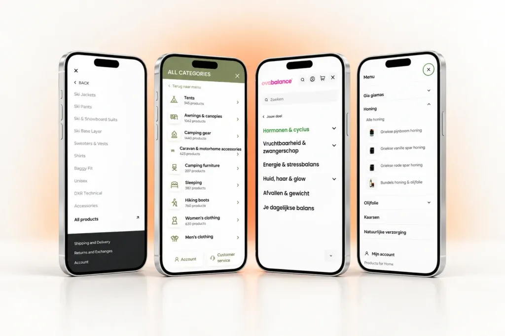
- Categories at the top level: Kampeerwinkel Roermond’s full-height mobile menu shows the same departments and product counts, with a search field beside the menu button.
- One group open at a time: on Products for Home, each product family is an accordion; opening Honing shows “Alle honing” and a thumbnail for every honey type.
- A shortcut to the shopper’s own need: Ovabalance’s mobile menu is goal-led, and collection pages open with goal chips such as Menstruatie and Overgang, plus a single “Verfijnen” filter button.
Size the rows for a thumb: WCAG 2.2 success criterion 2.5.8 (Level AA) asks for pointer targets of at least 24 by 24 CSS pixels, with exceptions such as enough spacing. For menu rows tapped all day, treat that as the floor.
Planning a redesign for a big catalogue?
Talk to our UI/UX team about your categories, your shoppers and the menu they need. We’ll agree the scope with you before any design work starts.
Keep the menu in step with the catalogue
An ecommerce mega menu is a second copy of your catalogue structure, and it goes stale when collections change. The platform’s own menu sets the baseline: Shopify’s help page on drop-down menus says a top-level item “can have up to two levels of nested drop-down menus” and that most themes support up to two levels.
Richer layouts, such as department cards with live counts, usually mean custom work. Kampeerwinkel Roermond’s All Categories menu is a custom section in its Shopify theme, and Products for Home’s image menu is a custom header element in the Bricks builder for WordPress. We compare a custom Shopify theme with a premium one in a separate guide.
Then keep it honest. Read counts and images from the catalogue (in a Shopify theme, collection.all_products_count returns the total number of products in a collection), and name an owner who adds new collections on launch day and removes empty ones.
Case study · Shopify · Netherlands, Belgium & Germany
Kampeerwinkel Roermond: a Shopify camping store
9,400+ outdoor products made easy to find, buy and collect, in three languages and with free pickup in Roermond.
- 9,400+ products online, every one on the same set of templates
- 14 departments in the All Categories menu, each showing its product count
- 3 storefront languages: Dutch, English and German
Menus in more than one language
Rehall’s storefront runs in English, Dutch and German, and Kampeerwinkel Roermond’s three storefronts each have their own URLs and share a compact language switcher. A menu in several languages needs three things.
- Translated menu labels, checked by a native speaker against the words people search for.
- A test of the longest label in each language. A German compound such as Wintersportbekleidung has no space to wrap at, and automatic CSS hyphenation only works when the page’s
langattribute is set. - One language switcher in a fixed place in the header.
Our guide to a multi-language Shopify store for Europe goes deeper.
Ecommerce mega menu checklist for your next redesign
Take this into the design review, before anyone starts debating colours. For the rest of the project, our website redesign checklist covers platform choice, technical SEO and redirects.
- Principle: the top level follows how most shoppers start: audience, product type, goal or look.
- Depth: the category tree is deep enough for a mega menu; if not, invest in search instead.
- Hover delay: panels open after 300–500 ms and close after a short grace period.
- Keyboard: every panel opens from a button; Escape closes it and returns focus.
- Mobile: categories at the top level, one group open at a time, a “View all” link in each.
- Counts and images: pulled from the live catalogue, not typed in by hand.
- Crawlable links: every destination is a plain
<a href>link in the HTML, not a script event. - Measurement: menu clicks tracked as analytics events and reviewed next to site search terms.
The order matters: pick the principle your shoppers start from, make the menu work with a mouse, a keyboard and a thumb, then give it an owner.
Want a second pair of eyes on your category tree before the redesign starts? See our UI/UX design for ecommerce or send us your current menu structure.
Frequently asked questions
What is a mega menu in ecommerce?
A mega menu is a large navigation panel that opens from the main menu and shows a whole branch of the catalogue at once: departments, their categories and often images. Laid out in columns, cards or tiles, it lets shoppers scan the range and pick a category in one step.
Should a mega menu open on hover or on click?
Both, on desktop. Hover is quick for mouse users if you add a delay of around 300 to 500 milliseconds so panels don’t open by accident. The same panel must also open from a button with a click, Enter or Space for keyboard and screen-reader users. On phones, menus open on tap.
How do you make a mega menu accessible?
Make each top-level item a button that shows and hides its panel and reports its state with aria-expanded, and keep the destinations as plain links. Escape should close the panel and return focus to its button. Content shown on hover must stay visible while the pointer moves onto it, as WCAG 2.2 success criterion 1.4.13 requires.
Are mega menus bad for SEO?
No, not when the links are real. Google can generally only crawl a link if it is an <a> element with an href attribute (see Google’s guidance on crawlable links), so a menu of plain HTML links gives search engines a clear map of your main categories. Problems start when menu items only work through JavaScript click handlers, or when a sitewide menu links to thin, near-empty collections.
How many menu levels does Shopify support?
A top-level item in Shopify’s menu editor can have up to two levels of nested drop-down menus, so three levels in total, and Shopify notes that most themes support up to two nested levels. Whether they appear as a dropdown or a mega menu depends on the theme; richer layouts, such as department cards with live product counts, usually need a custom section.